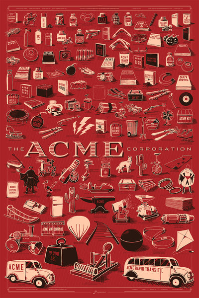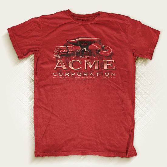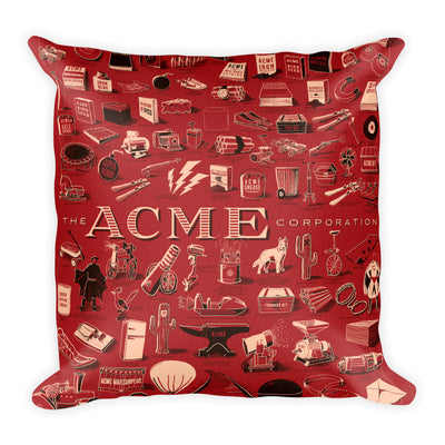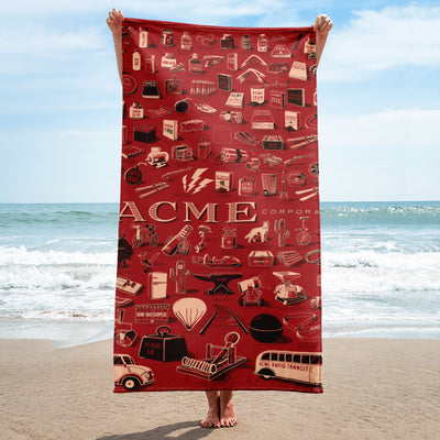
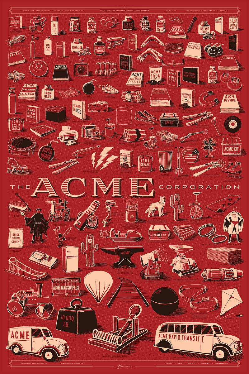
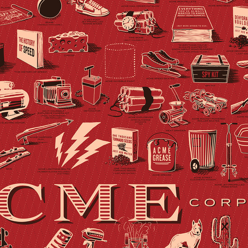
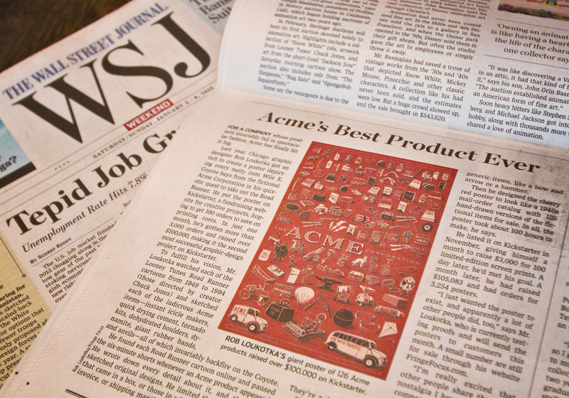
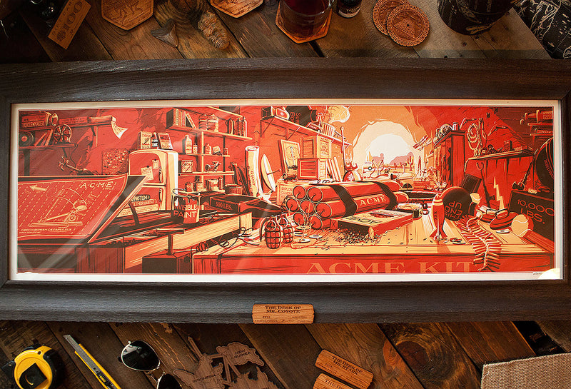
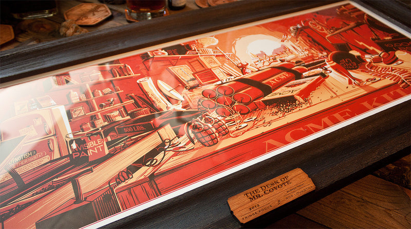
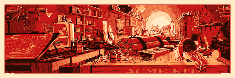
The ACME Corporation
24x36" Giclee print on matte paper.
A giant poster of every ACME product, ever. 126 drawings of explosives, gadgets, rockets, and more!
I watched every... Learn more
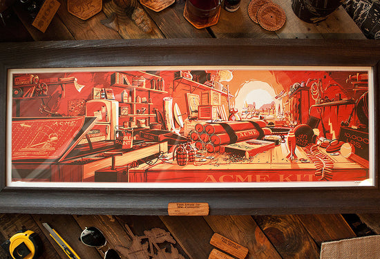

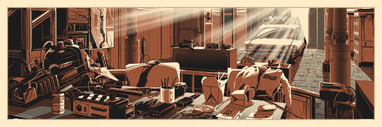
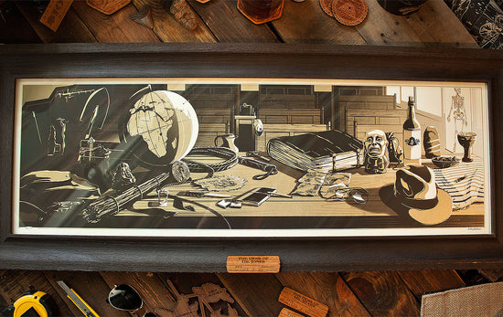
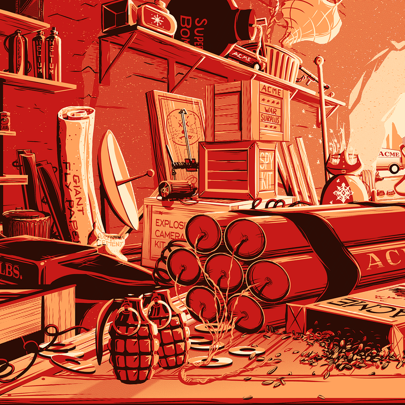
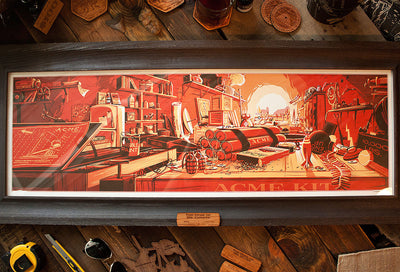
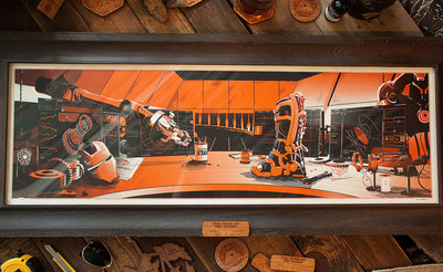
The Desk of Mr. Coyote
Every ACME product ever, in a cave. 126 rockets, gadgets, and explosives from our favorite desert coyote.
I drew every single object that Wile E. Coyote ever purchased from the... Learn more